Welcome Guest ( Log In | Register )


Add Reply
> Showroom, Show your graphics here!
*Stella*
post Jul 10 2009, 10:40 AM
Post #1


Cosmix Fairy
*******

Group: Honor Members
Posts: 3,839
Joined: April 7 2007
From: Germany


I thought, this could be quiet good and helpful

This is the graphic Showroom - you can post your graphics here, so everyone can see them and comment on them.
I think it can be helpful for "beginners" (and for the others too xD) to improve their graphic skills..
(omg sorry for my english xD)


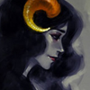
I have a signature, maybe some of you want to comment it icon_wink.gif


--------------------


Go to the top of the page
humbu111
post Jul 10 2009, 8:07 PM
Post #2


Cosmix Fairy
*******

Group: Former Staff
Posts: 28,010
Joined: March 23 2008
From: somewhere over the raiinbow


--------------------

Credits to Bre for the forum set, and Ditty/Esca for the userbar :D


Go to the top of the page
angel123
post Jul 11 2009, 12:02 AM
Post #3


Cosmix Fairy
*******

Group: Senior Member
Posts: 9,231
Joined: October 2 2008
From: Florida


i like that too icon_wink.gif its very cool! the spine makes it look like a drawing from a book too


--------------------
Thanx jah, i love it ^_^
Go to the top of the page
Tash
post Jul 16 2009, 2:12 AM
Post #4


Harmonix Fairy
****

Group: Members
Posts: 287
Joined: June 16 2009
From: AAAAAAAUSSIE LAND


That's really really nice!

do you know where i can find that PNG?


--------------------
Go to the top of the page
AnnieBelle
post Jul 16 2009, 2:45 AM
Post #5


Cosmix Fairy
*******

Group: Honor Members
Posts: 4,639
Joined: August 29 2007
From: USA


This is a good idea for a topic, now I don't have to bother Ditty asking for opinions on my icons~!

@the signature up there: Whoa~ the notebook texture looks really cool, I always love graphics that use that, but I can never seem to find a good texture to use it myself.
And the colors are quite nice.

I've got an icon I'd like an opinion on, because I have mixed feelings about it.


It looks a little...I don't know exactly, I just feel as though there's something weird-looking about it, but I can't put my finger on it.


--------------------
Go to the top of the page
Natasha
post Jul 16 2009, 12:52 PM
Post #6


Enchantix Fairy
**

Group: Members
Posts: 112
Joined: July 4 2008
From: A magical castle in the sky.


I have a few :] they're a little old tho


--------------------
Go to the top of the page
dittadulla
post Jul 16 2009, 1:03 PM
Post #7


Cosmix Fairy
*******

Group: Journalists
Posts: 4,880
Joined: February 19 2008
From: +1 isolated rock in the atlantic


QUOTE (AnnieBelle @ Jul 16 2009, 02:45 AM) *
This is a good idea for a topic, now I don't have to bother Ditty asking for opinions on my icons~!

@the signature up there: Whoa~ the notebook texture looks really cool, I always love graphics that use that, but I can never seem to find a good texture to use it myself.
And the colors are quite nice.

I've got an icon I'd like an opinion on, because I have mixed feelings about it.


It looks a little...I don't know exactly, I just feel as though there's something weird-looking about it, but I can't put my finger on it.


It *is* preeeetttyyyyy. I told you befooreee there's nothing wrong with it.


--------------------
Go to the top of the page
dittadulla
post Jul 20 2009, 12:36 AM
Post #8


Cosmix Fairy
*******

Group: Journalists
Posts: 4,880
Joined: February 19 2008
From: +1 isolated rock in the atlantic


Ahaha do you know what happens when Ditty goes crazy with a bubble texture?


The GR in the corners stands for 'Golden Rain', a site that I'm gonna be working on creating XD

This post has been edited by dittadulla: Jul 20 2009, 12:37 AM


--------------------
Go to the top of the page
fullmoon
post Jul 20 2009, 1:58 AM
Post #9


Cosmix Fairy
*******

Group: Honor Members
Posts: 4,766
Joined: April 1 2007
From: Here.


Aha! So thats the site. :) I like your bubbly graphics. Keep them up. I can't wait to see your site open.

-Critique-
I love the way everything is positioned but try to refrain from using too many different types of fonts. I think two or three types are the maximum. If you use to many it starts to look a little tacky. ><

Though it is not necessary, try using color scheme of two or three colors when you create the graphic. It may help maintain a balance.

-----

I haven't created anything for a llong time now (a month).


Comment and I shall be happy. :) Critique is nice.

This post has been edited by fullmoon: Jul 20 2009, 2:13 AM


--------------------

I am not WEIRDhopefullyI think

"Two things are infinite: the universe and human stupidity; and I'm not sure about the former." ~ Albert Einstein
Go to the top of the page
{§hani}
post Jul 20 2009, 10:04 AM
Post #10


Cosmix Fairy
*******

Group: Members
Posts: 2,886
Joined: February 20 2009
From: Another Sky


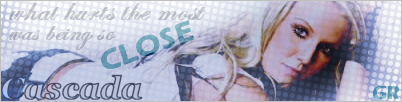
most lovely chia, althogu h i cant help feel likes its crowded on the edges, like it needs to be focused on the center images. perhaps erase a few white blobs on the bottom half.? just a critique icon_wink.gif

~ ~ ~ ~ ~ ~
what about this?


Edit: double post O-O

This post has been edited by {§hani™}: Jul 20 2009, 10:05 AM


--------------------


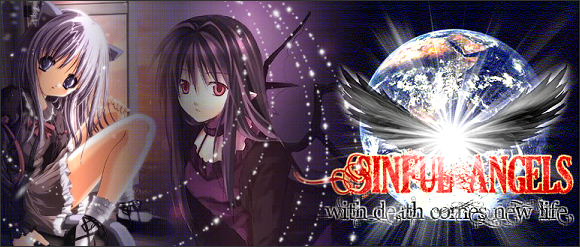
I AM A HORROR. LOVELY SET BY EMI. MUSA DRAWN BY ALAMISTERRA.
Go to the top of the page
dittadulla
post Jul 20 2009, 10:56 AM
Post #11


Cosmix Fairy
*******

Group: Journalists
Posts: 4,880
Joined: February 19 2008
From: +1 isolated rock in the atlantic


@Breana: Thanks! :3 And thanks for the critique; I was unsure about the text XDD

@Shan: I like how you positioned everything, but it feels kinda empty on the left side to me o-o


--------------------
Go to the top of the page
Another Morning
post Jul 20 2009, 11:04 AM
Post #12


Cosmix Fairy
*******

Group: Honor Members
Posts: 4,944
Joined: April 7 2007
From: LOOK BEHIND YOU


Okay, so I know basically nothing about going about making graphics XD But I figure that aesthetically, I can still offer some ideas.

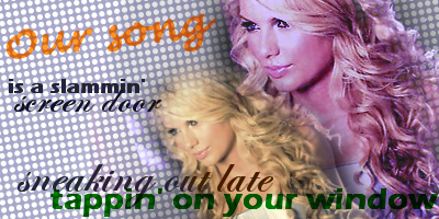
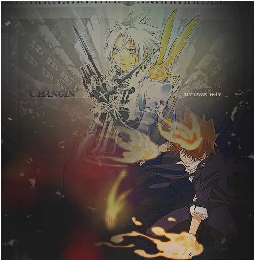
Natasha: On the KH one, it took a bit of time for me to read the words at the bottom since the background had a lot going on.

FM: Making the picture darker like that is cool, but the focus of the picture gets kind of washed out. So maybe you could either make the whole thing just a bit lighter, or just lighten up the middle bits while keeping the edges the same.

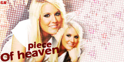
Shani: I agree with Ditty that the left looks a little bare in comparison to the right. Maybe even just a more elaborate font at a larger size would help balance it out.

yaey 8D


--------------------
RIP Falicia (AngelDarkstorm, Anime-Princess) :: 01/19/1990 - 05/25/2013 :: I love you, Sisser.


"I am so clever that sometimes I don't understand a single word of what I am saying." ~Oscar Wilde
Go to the top of the page
fullmoon
post Jul 20 2009, 6:46 PM
Post #13


Cosmix Fairy
*******

Group: Honor Members
Posts: 4,766
Joined: April 1 2007
From: Here.


Thanks for the critique. ^.^

AM and Ditta already took what I said. icon_razz.gif It seemed like there is a party on the right side while the left is simple just like what they said. The texture you used underneath the text is nice though. XD

I fixed the graphic by the way. :)


This post has been edited by fullmoon: Jul 21 2009, 1:42 AM


--------------------

I am not WEIRDhopefullyI think

"Two things are infinite: the universe and human stupidity; and I'm not sure about the former." ~ Albert Einstein
Go to the top of the page
humbu111
post Jul 22 2009, 11:46 PM
Post #14


Cosmix Fairy
*******

Group: Former Staff
Posts: 28,010
Joined: March 23 2008
From: somewhere over the raiinbow


This post has been edited by humbu111: Jul 22 2009, 11:46 PM


--------------------

Credits to Bre for the forum set, and Ditty/Esca for the userbar :D


Go to the top of the page
dittadulla
post Jul 23 2009, 12:20 AM
Post #15


Cosmix Fairy
*******

Group: Journalists
Posts: 4,880
Joined: February 19 2008
From: +1 isolated rock in the atlantic


YAY FOR LIVEMOCHA AVI WITH RANDOM BRUSHES.


--------------------
Go to the top of the page
W.I.N.X
post Jul 24 2009, 1:12 PM
Post #16


Cosmix Fairy
*******

Group: Honor Members
Posts: 3,858
Joined: February 19 2008
From: A Land Down Under


*Pokes avi and sig*. My first set I'm happy to reveal to the public eye XD. Although it's extremely obsessive...

This post has been edited by W.I.N.X: Jul 24 2009, 2:12 PM


--------------------


Badge by Morny.
Personal Photo made by sailorvs4
Go to the top of the page
fullmoon
post Jul 24 2009, 9:49 PM
Post #17


Cosmix Fairy
*******

Group: Honor Members
Posts: 4,766
Joined: April 1 2007
From: Here.


Lol! I like your first set! It is cute and well-made! :) What movie is it from?

Your first avi is color with brushes Bu. O_o icon_razz.gif


--------------------

I am not WEIRDhopefullyI think

"Two things are infinite: the universe and human stupidity; and I'm not sure about the former." ~ Albert Einstein
Go to the top of the page
W.I.N.X
post Jul 25 2009, 2:20 AM
Post #18


Cosmix Fairy
*******

Group: Honor Members
Posts: 3,858
Joined: February 19 2008
From: A Land Down Under


Thanks! It's from the stage musical Phantom of the Opera, which I...shamelessly fangirl over...

This post has been edited by W.I.N.X: Jul 25 2009, 3:11 AM


--------------------


Badge by Morny.
Personal Photo made by sailorvs4
Go to the top of the page
fullmoon
post Aug 20 2009, 3:18 AM
Post #19


Cosmix Fairy
*******

Group: Honor Members
Posts: 4,766
Joined: April 1 2007
From: Here.


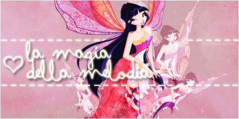
What do you think of this layout top? I made it as an layout example of my shop. ^^ Since it was an example, I didn't really go looking for inspiration so it is a rather simple. Please critique!


--------------------

I am not WEIRDhopefullyI think

"Two things are infinite: the universe and human stupidity; and I'm not sure about the former." ~ Albert Einstein
Go to the top of the page
fullmoon
post Aug 20 2009, 4:50 AM
Post #20


Cosmix Fairy
*******

Group: Honor Members
Posts: 4,766
Joined: April 1 2007
From: Here.


Aww thanks. ^^ I appreciate your comment. Any critique?


--------------------

I am not WEIRDhopefullyI think

"Two things are infinite: the universe and human stupidity; and I'm not sure about the former." ~ Albert Einstein
Go to the top of the page

Add Reply
1 User(s) are reading this topic (1 Guests and 0 Anonymous Users)
0 Members:


RSS Time is now: 27th April 2024 - 6:48 PM